


Should I Use ChatGPT Ad Manager"? Not if Your Website Crap

ChatGPT Ad Manager is Coming, But Can Your Website Convert?
In the world of digital marketing, there's a lot of buzz around AI-powered ad management tools like ChatGPT Ad Manager and how they could revolutionise the way businesses reach and engage their target audience. But the same fundamental problem would ruin everything.
As the ChatGPT Ad Manager becomes the next must-have marketing tool, businesses are racing to become early adopters and gain a competitive edge in this new marketing channel. The window will be small, but a huge advantage for sure.
However... Here's the rub. There's one very BIG problem that will put the brakes on that dream of being first to dominate AI ads and make millions. Even if you're generating a tonne of leads through ChatGPT ads, if your website is poorly optimised, as in it converts less than 3% of your monthly visitors, you could be losing more leads than you hope to gain. That's right, a bad-converting website is like running a bath with the plug left out – no matter how much water you pour in, it just keeps draining away.
Let me put some maths behind this for context.
If your website converts leads at a rate of 1%
You get 250 visitors to your site per month
Your average order value is £2500
You gain 2.5 customers with a total value of £5k.
But, if you can lift your average conversion rate to
2%, you'd make £10k (£120k p/a)
3%, you'd make £15k (£180k p/a)
4%, you'd make £20k (£240k p/a)
These numbers are not to be sniffed at. In a world of ever-increasing ad spend, improving your website conversion doesn't just improve your ROAS, it transforms your bottom line with almost zero investment.
I can hear the voices now. "Why doesn't everyone 'fix their website conversion rate'?
I've come to the conclusion over the last 17 years, businesses love to waste money on shiny stuff. Running ads, doing content feels like quick value and it can be. Businesses become blinded by spending more to get more; we overlook the most obvious revenue-generating activities. Plus, most website builders are not sales and marketing specialists with decades of experience, a Master's Degree in strategic marketing and a passion for human psychology.

example: The hero banner features a stunning mountain landscape, but the text is hard to read due to poor contrast. The multiple calls-to-action create confusion, and the "Account" button blends into the background. In the first 5 seconds, this hero banner fails to effectively communicate value and guide visitors to take action. Looks nice. Doesn't work.
So, how do you make sure your website is optimised to convert all those hard-earned leads? That's exactly what we'll be diving into in this blog post. We'll be sharing tips, best practices, and real-world examples to help you create a seamless online customer experience that turns visitors into customers.
Why Website Conversion Optimisation Matters More Now Than Ever
With the rise of AI-powered marketing tools like ChatGPT Ad Manager, the competition for online attention is fiercer than ever. You might be able to get people to click on your ads, but if your website doesn't deliver on the promise of your ad, those visitors will bounce faster than a basketball.
Not only that. If done properly, the content, social proof, authority signals, and FAQs we add to your website help Google, Gemini, ChatGPT, and Claude understand your business, find you relevant, and recommend your services when potential customers are searching for solutions.
Websites have always been the shop window for any business, but now they are much bigger than that. They are the foundation of your entire digital marketing strategy, the source of information AI platforms rely on, and often the deciding factor between a visitor becoming a customer or clicking the back button.
The reality is very, very simple: driving more traffic to a poorly optimised website rarely produces better results. By creating a user-friendly, simple, intuitive, and compelling website experience, you can keep visitors engaged, build trust and credibility, and guide them towards a purchase or desired action.
In fact, countless studies have shown first impressions count when visitors land on your website. Peer-reviewed research published in Behaviour & Information Technology found that users form an opinion about a website's visual appeal in as little as 50 milliseconds. These first impressions tend to persist, influencing how visitors perceive a company's credibility, professionalism, and trustworthiness. We all know attention spans are getting worse and we are in a real trust recession, so why do so many businesses still have a hero section saying "Your trusted partner in success" or other vague useless copy that means nothing to the visitor? Because website builders aren't true marketing and sales experts and most businesses from £500k-£3 million don't have deep marketing specialists who obsess over what visitors see, think, feel and do, just like MSM. So the end result is ChatGPT or Claude writing most of the website copy, with amazing taglines like "Real Customers. Real Results." that have been used across millions of websites, instantly telling both visitors and search engines that there's nothing unique or valuable here because your website reads like millions of others. So, you struggle to rank, and the visitors who do land on your website often bounce because it feels robotic and generic.
If you can take one thing away from this blog: Be better than ChatGPT.
Here are the Key Elements of a High-Converting Website That Doesn't Need ChatGPT's Help
So, what does a high-converting website really look like? Nothing exceptional happens by chance. While every business is unique, there are some key elements that all great websites share:
A clear and compelling messaging designed to target YOUR ideal customer type
Within seconds, your website should clearly communicate what you offer, how it benefits the visitors, and why they should choose you over the competition. This is often referred to as the "hero message" and it's the most important real estate on your site. You have about 5 seconds to capture a visitor's attention and convince them to stay, so your hero message needs to be clear, concise, and compelling. Use strong headlines, subheadings, and bullet points to quickly convey your unique value proposition and benefits. Remember, people think logically, but buy emotionally, so use it in your copy. We are all either running away from pain, or running towards desire and it's our job to understand where our ideal customers are on this journey.
User-friendly navigation (Keep it chuffing simple)
We must make it easy for visitors to find what they're looking for with intuitive menus, clear categories, and logical site structure. If there is any risk of visitors getting confused, frustrated or lost, it's almost a certainty that they will and then bounce. A GREAT website must avoid clutter and keep your navigation simple and straightforward. Use clear, descriptive labels for your menu items, call to actions and organise them in a way that makes sense for your audience. Consider using drop-down menus or mega menus for larger sites with many pages or categories. (show bad and show good)
Site and page load speeds kill traffic
Use techniques like compression, caching, and content delivery networks (CDNs) to ensure your website loads quickly on all devices. Use professional website platforms that allow you to make changes and optimise your backend. Cheap naff website self-build sites remove these options and limit your ability to make changes and improve performance. Slow loading times are a major turn-off for visitors and can significantly impact your conversion rates at a significant rate, so, optimise your images, minify your code, and leverage browser caching to speed up your site. Aim for a loading time of 3 seconds or less for desktops and sub 5 seconds for mobile.
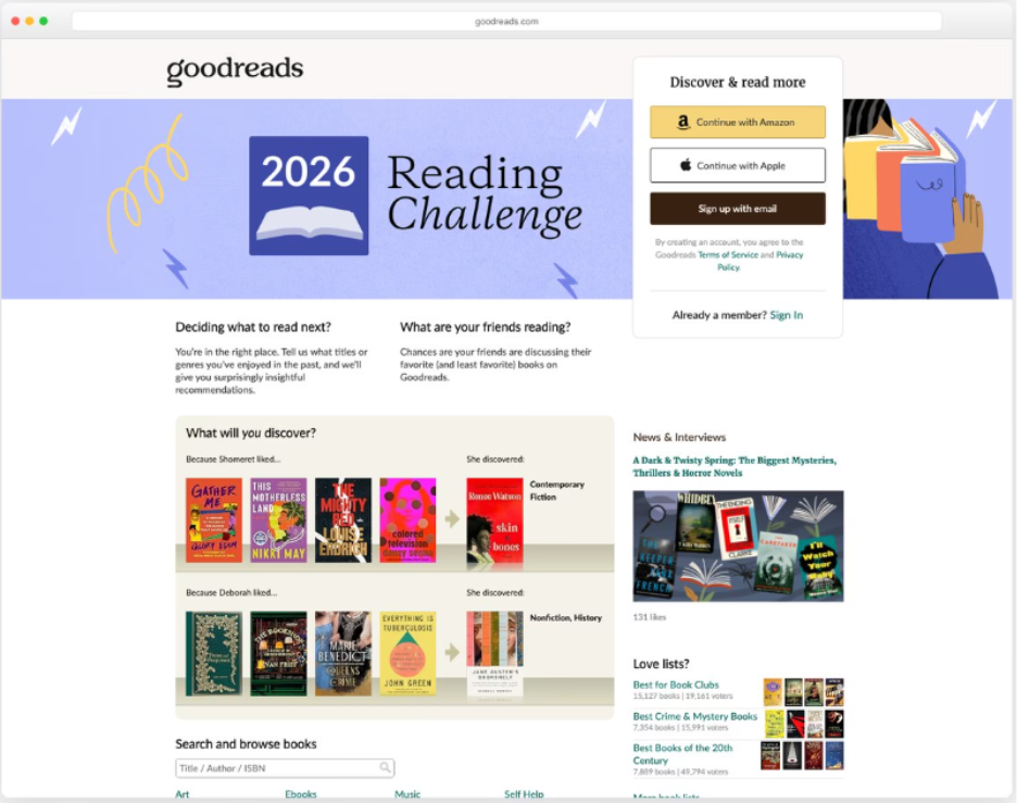
Example of a bad user journey. Everything on this page is competing for attention.
Mobile search dominates search traffic so make your website a mobile-friendly design:
With more than half of all web traffic coming from mobile devices these days, your website must be optimised for smaller screens and touch-based navigation. Use responsive design techniques to ensure your site looks and functions great on all devices, from desktop computers to smartphones. Make sure your buttons and links are large enough to tap easily, and avoid using pop-ups or other elements that can be frustrating on mobile.
Strong calls-to-action (CTAs): Guide visitors towards a desired action with prominent, compelling CTAs that stand out from the rest of the content. Your CTAs should be clear, specific. Use contrasting colours, whitespace, and directional cues to draw attention to your CTAs and make them impossible to miss. Test different variations of your CTAs to see which ones perform best and super important, give two options for the phase the buyers are in. Example would be, for high-intent buying phase you can use "book now", "request call back", "buy now". For visitors who are in the learning phase, use call to actions like "get your free survey", "download guide", "learn more".
Social proof, risk reduction and trust signals
Every visitor, potential customer is on a learning mission for one very simple, but very important factor. To reduce the risk of making a terrible mistake. So how do we put the lead first and help them build trust?
Use customer testimonials, logos of well-known clients, security badges, and other trust signals to build credibility and reduce perceived risk. Place these elements prominently on your site, especially on your homepage and product pages. Visitors are more likely to trust and buy from a site that showcases satisfied customers and reputable partners. If you have any awards, certifications, or press mentions, be sure to highlight those as well.
Streamlined checkout process: If you're selling products or services online, make sure your checkout process is simple, secure, and transparent, with minimal friction and distractions. Reduce the number of steps required to complete a purchase and only ask for essential information. Offer a variety of payment options, and provide clear, upfront information about shipping costs, taxes, and delivery times. Use trust symbols like SSL certificates and security logos to reassure visitors that their information is safe.
The Big Ticket Item... How to Optimise Your Website for Conversions
Now that you know what a high-converting website should/could look like, how do you actually go about optimising your own site?
Here are some steps you can take today that will cost you zero pounds. Just let that sink in for a second. How many marketing activities that can make you large sums of money typically cost you nothing? Google Ads and Facebook Ads cost a small fortune. As more businesses enter the market and competition continues to increase, advertising costs keep rising, forcing many companies to spend more money to generate the same leads and sales they once achieved with smaller budgets.
That's exactly why website optimisation matters. If every click costs more than it did a few years ago, squeezing more value from the traffic you already have becomes one of the smartest and most cost-effective investments you can make as a business. And when done properly, it can have a HUGE impact on your enquiries, leads, and sales without increasing your advertising spend.
OK. Let's get into it.
How to Optimise Your Website for Conversion
Conduct User Testing
One of the fastest ways to uncover conversion issues on your website is to watch real users interact with it. We do this for hours, every single day and it's our bread and butter service.
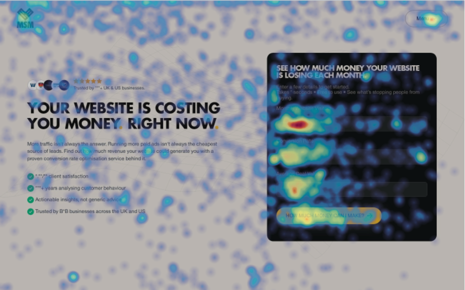
Data is your friend when it comes to understanding user patterns and behaviours.
You already know your website inside out, which means you're blind to many of the problems your visitors experience. User testing helps expose confusing navigation, unclear messaging, broken user journeys, and friction points that stop visitors from taking action.
Using tools like UserTesting, Hotjar or Microsoft Clarity help you monitor:
How far users scroll down each page
Which sections receive the most engagement
High-click and rage-click zones
Areas users completely ignore
Session recordings of visitors navigating your site
Points where users abandon forms or leave the page
Note: Pay particular attention to pages with high traffic but low conversion rates. If users are landing on the page but not taking action, there is usually a disconnect between what they're expecting and what they're seeing.
The goal isn't to collect data for the sake of it. The goal is to identify friction and remove it.
Analyse Your Website Data
Most businesses have access to valuable data but almost never actually use it.
When was the last time you downloaded a CSV from Google Console to look at impressions, CTRs, position and all the other amazing data? I should think 99% would maybe not even know what I'm talking about.
Tools such as Google Analytics, Google Search Console, Hotjar, Microsoft Clarity, and your own CRM can reveal exactly how visitors interact with your brand and your website every single day. Some of them are free too.
What you should look for:
Pages with high bounce rates
Pages with high exit rates
Traffic sources generating the highest-quality leads
Keywords driving organic traffic
Landing pages with strong traffic but poor conversions
Device-specific performance issues
Geographic locations generating the most enquiries
Days and times when visitors are most active
For example, if a service page receives 1k visitors per month but only generates two enquiries, the problem isn't traffic. The problem is clearly the conversion mechanism.
Likewise, if mobile users convert significantly worse than desktop users, there may be usability issues affecting a large percentage of your visitors.
The more data you collect and analyse, the more confidence you'll have when making optimisation decisions. Build confidence and proof by Running A/B tests
Guessing is not optimisation.
A/B testing allows you to compare two versions of the same page or page element to determine which performs better based on real user behaviour. Just like you would with ad campaigns. My advice to anyone is not to run ads or increase budget until you know your website, website page or landing page converts. Once it does, push as much traffic as you like.
Here are our top 10 elements to test:
Hero headlines
Sub-headlines
Call-to-action and button types, colours, sizes and styles.
Contact forms, specifically the amount of information fields
Page layouts
Images
Testimonials/social proofing
Pricing displays or price bracketing
Trust signals/ performance metrics and positioning
Offers and guarantees or objection handling
FAQs
Small changes can produce significant results as we mentioned earlier, especially for ecom brands. For example, changing a CTA from "Submit" to "Get My Free Quote" may increase conversions because it communicates a clearer outcome and the risk reduction for the lead has been significantly reduced.
The key is to test one variable at a time. If you change five things simultaneously, you'll have no clue which change produced the result.
Optimise for Search Engines. Yep. This is still important
Driving more traffic to a poorly optimised website is pointless. Before focusing on rankings, ensure your website provides a strong user experience and is structured in the correct way.
Start with the basics before doing anything:
Clear page hierarchy
Logical navigation structure
Fast loading speeds
Mobile responsiveness
Internal linking
Optimised metadata
Relevant keyword and search term targeting
High-quality, unique content. Not AI slop. Yes, you can use it, but put your own thoughts, feelings and emotions into it.
Clear calls to action
Index your website after every big update
Google's goal is to provide users with the best possible result. If visitors arrive on your site and quickly leave because the page loads slowly, lacks relevance, or creates a poor experience, your rankings can suffer over time.
SEO and CRO should and do work together. More traffic means nothing if visitors don't convert. This is where we earn our money. Getting that balance right is both a science and an art.
Continuously Iterate and Improve
Conversion rate optimisation is not a one-time set and forget project.
Consumer behaviour changes. Competitors improve their game. Search algorithms evolve. Market conditions shift and then AI flips everything on its head and everyone scrambles to recover.
The highest-performing websites are constantly being refined based on real-world data every month to make sure your brand stays top of Google, ranked high in AI platforms, so impressions, CTRs, website leads conversions continue to increase over time.
Real-World Examples of High-Converting Websites
To give you some inspiration, here are a few examples of websites that are crushing it in terms of conversions:
Dropbox: With a simple, clear homepage that immediately communicates the value of the product and a streamlined signup process, Dropbox has achieved a signup conversion rate of up to 10%.
Airbnb: By using compelling imagery, social proof, and a user-friendly search and booking process, Airbnb has become the go-to platform for vacation rentals, with a conversion rate of around 5%.
Slack: With a clear value proposition, engaging product demo, and simple signup process, Slack has achieved a staggering 30% conversion rate for free trial signups (free... low-risk decision making).
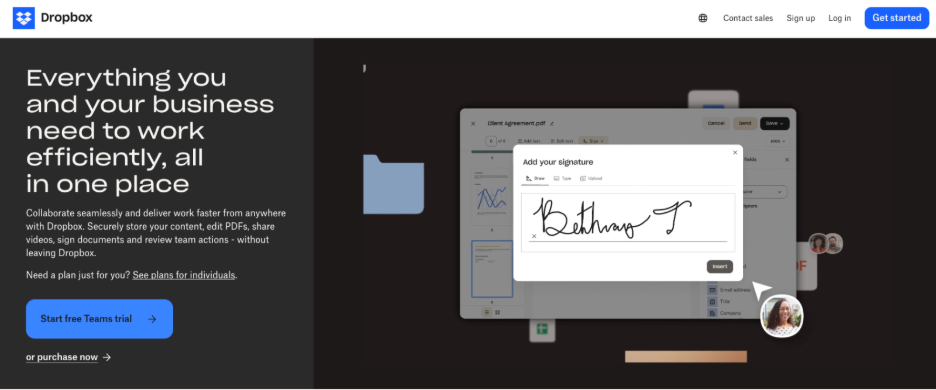
Dropbox nailed it: This hero banner captures attention, communicates value, and guides users towards the next steps within the crucial first few seconds of their visit. The design combines clear messaging, strong visual hierarchy, and focused calls-to-action to maximise conversion potential. Be like Dropbox.
Summary
As the ChatGPT Ad Manager and other AI-powered marketing tools continue to evolve and gain adoption, website optimisation will only become more critical for businesses looking to stay competitive, increase awareness and convert leads into customers.
By focusing on creating a seamless, user-friendly website experience that communicates your value proposition, builds trust and credibility, and guides visitors towards a desired action, you can turn your website into a lead-converting machine.
Remember, website optimisation is an ongoing process. Keep testing, analysing, and iterating based on data and user feedback, and you'll be well on your way to creating a high-converting website that turns visitors into customers and drives real business results.
If you're looking for help optimising your website for conversions, check out our website and see how we can help your business make more money.
Conversion rate optimisation improves every step from attention to closed sale. Learn how MSM finds leaks across marketing, sales, CRM and follow-up.
How full-funnel marketing is transforming how businesses think about sales and marketing.