


Best Changes to Increase Website Conversions Fast

Best Changes to Increase Website Leads Fast
4 min read · Conversion Rate Optimisation
Disney spent decades building the most visited theme park on earth.
They didn't do it with bigger rides. They did it by obsessing over every single moment a visitor experiences — before, during and after their visit.
Every queue, every sign, every interaction is deliberate. Nothing is left to chance. The result is a 70% return rate from first-time visitors and a brand so trusted that people plan their holidays around it years in advance.
Your website is your Disney World. Most visitors arrive, look around for a few seconds, and leave. Not because your product isn't good enough — but because the experience didn't give them a reason to stay.
The fastest changes to increase website conversions aren't about redesigns or big budgets. They're about the same thing Disney obsesses over — removing friction, building confidence, and making the next step obvious. Here are the five that move the needle fastest.

Most businesses looking for faster conversions assume the answer is a new website. It almost never is. The changes that produce the fastest results are almost always the smallest — a headline rewritten to speak to the visitor's problem, a contact form stripped back to three fields, a phone number moved above the fold, a page that loads in two seconds instead of six. These aren't glamorous changes. But they're the ones with the most immediate, measurable impact.
The data behind these changes.
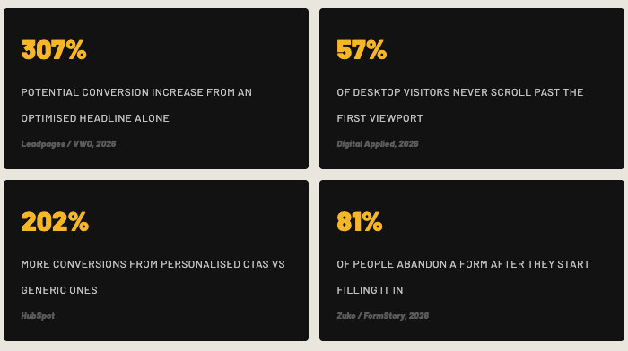
Before we get into the five changes, here's what the research shows about where conversion is won and lost.
01: Rewrite your headline around the visitor's problem — Up to 307% lift
The average visitor decides whether to stay or leave in under five seconds. Your headline is doing almost all of the work in that window. A headline that opens with your company name or your years of experience tells the visitor nothing useful. One that names the specific problem they arrived with keeps them reading.
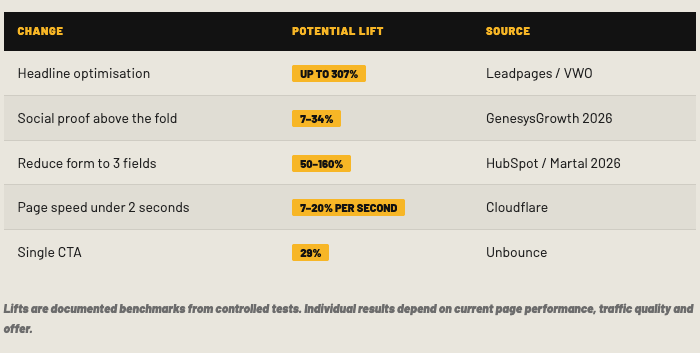
A well-optimised headline can increase conversions by up to 307%. In one documented case, a telecom company recorded a 76% increase in conversion rate from headline and CTA changes alone — no new traffic, no redesign. Just different words in the right place. Movexa achieved a 90% uplift in sales by adding just one additional word to their headline.
Benefit-led headlines outperform feature-led by 27% Headlines with a specific number convert 15% higher Simple language converts 2× better than complex
Sources: Digital Applied 2026, Unbounce, VWO case studies
02: Move your strongest proof above the fold — 7–34% lift
Your best testimonial, Google rating, or case study result should be visible without scrolling. Most visitors won't scroll far enough to find proof buried halfway down a page — which means you're asking them to trust you before you've given them a single reason to.
64% of mobile visitors never scroll past the first viewport. Social proof within the first viewport — logos, ratings, client counts — lifts conversion by 12% on its own. A specific testimonial with a name, role and measurable result placed immediately above or beside your form consistently outperforms pages without it.
Adding customer proof above the fold consistently produces measurable conversion uplift. Applied to a page receiving 2,000 visitors a month at a £2,000 average contract value, the revenue difference compounds quickly.
Sources: Digital Applied 2026, GenesysGrowth 2026
03: Reduce your contact form to three fields maximum — Up to 160% lift
Three-field forms produce the highest conversion rates consistently across industry benchmarks. Reducing form fields to five or fewer doubles conversion rates. Every field beyond five represents a 20–30% conversion penalty.
HubSpot's research found that reducing form fields from 11 to 4 more than doubled the conversion rate. 81% of people abandon a form after starting it — and every extra field you add increases that abandonment rate.
Name, email, and a brief message is enough to start a conversation. Everything else can wait for the call. The goal of your contact form isn't to collect data — it's to get the conversation started.
3: field forms = highest opt-in rate Each extra field costs 20–30% conversion Multi-step forms convert 86% higher than single-step
Sources: HubSpot, Marketing LTB 2026, Venture Harbour
04: Fix your page load speed — 7–20% per second
A one-second delay in page load time reduces conversions by 7% on desktop. On mobile, that figure rises to as much as 20% per second. A page taking four seconds to load on a phone has already lost a significant proportion of the visitors who would have converted — before they've seen a word of your content.
Pages loading under two seconds convert 32% higher than slower pages. Pages that load in one second convert three times more than pages that load in five seconds.
Run your site through Google PageSpeed Insights today. It's free, it's specific, and it tells you exactly what to fix. This is consistently the highest-leverage technical change available — and one of the few that requires no copywriting, no design work, and no A/B testing to validate.
Under 2 seconds = 32% higher conversion 1 second load = 3× more conversions than 5 seconds 53% of users leave if a page takes over 3 seconds
Sources: Cloudflare, Rudys.AI 2026, Marketing LTB 2026
05: Define one primary call to action — 29% lift
When visitors are given too many choices, they make none. Hick's Law — established in behavioural psychology — shows that decision time increases with the number of options available. On a web page, that extra decision time almost always becomes abandonment.
A single, clear CTA achieves a 13.5% average conversion rate. Pages with two to four CTAs convert at 11.9%. Pages with five or more links convert at 10.5%. That's a 29% improvement simply from removing options that compete with your primary goal.
One clear, prominent action repeated at the right moments in the page consistently outperforms a page offering multiple routes. Remove anything that isn't your primary conversion goal, measure what happens to your enquiry rate over 30 days, and you'll rarely want to add it back.
Sources: Unbounce, Marketing LTB 2026, Growth Stack Blog 2026
The combined impact of all five changes.
Applied together, these five changes consistently produce the fastest measurable improvement to website conversion rate without a redesign. Here's a summary of the data.
Disney doesn't leave anything to chance. Every part of the experience is measured, tested and refined. That's why 70% of first-time visitors come back. It's not magic. It's deliberate.
Your website works the same way. Your conversion rate is measurable. It's fixable. And it's directly tied to your revenue. Treat it that way and the results compound.
Which changes will move your numbers most?
Every website is different. The change that produces a 50% lift on one site might produce 5% on another depending on where the current friction is. The fastest way to find out which of these five will have the biggest impact on your specific website is a CRO audit — a structured review of your pages, user journey, messaging and conversion flow that tells you exactly what to fix first and why.
That's what we do at MSM. We've generated over £1.2 million in additional revenue for clients through conversion rate optimisation. No extra ad spend. No new website. Same traffic, converting properly.
Find out which changes will move your conversion rate most
Book your CRO audit →
Conversion rate optimisation improves every step from attention to closed sale. Learn how MSM finds leaks across marketing, sales, CRM and follow-up.
How full-funnel marketing is transforming how businesses think about sales and marketing.